
These are the simple and rough ideas I came up with:

1. More professional and exciting

2. A lot rougher. I'm not a big fan of this but I did it anyway.

3. Simple, using red as the main colour. Inspired by the Japanese flag
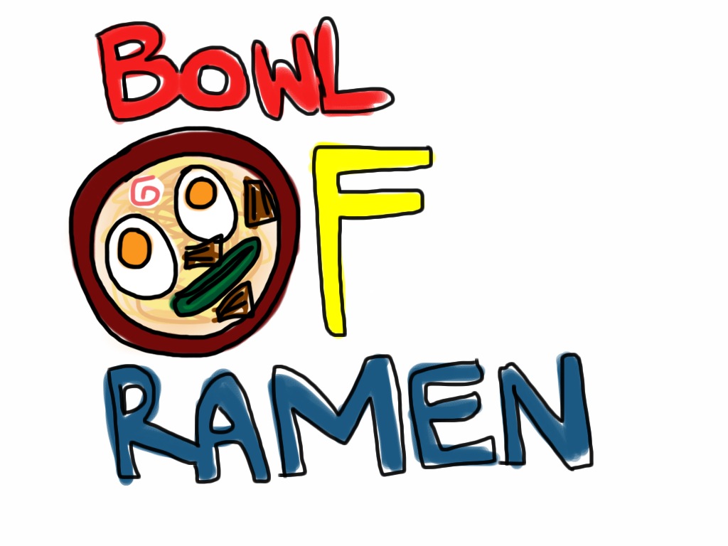
4. I think this is my favourite as it is a bit fun and colourful.
When we as a group make a decision we'll let you know! Feel free to give us an opinion!
Sam ^.^
No comments:
Post a Comment